The Engineering Institute of the National Autonomous University of Mexico (UNAM) recognizes the importance of online presence as a fundamental means to stay updated and provide a better experience to its users. Through its commitment to academic excellence and technological innovation, the Institute continues to drive research and development in science and engineering, promoting broader access to knowledge.
UX
UI
Developer
Engineering Institute of the National Autonomous University of Mexico
Figma
Webflow
The website of the Engineering Institute of the National Autonomous University of Mexico (IIUNAM) is a valuable source of information, as this institution is dedicated to the study, research, and development of engineering-related topics. However, it is important to highlight that the current homepage of the website does not provide enough options for a more accessible and efficient navigation, as it does not match the navigation of the rest of the site, which is developed in the SharePoint CMS.
The decision has been made to completely redesign the homepage of the IIUNAM website, taking into account the main navigation developed in SharePoint. The goal is to optimize the space by implementing a modular system that allows users to scan through more options in less time and with reduced visual fatigue.
Interview with the client
Expectations
Needs
Goals
Understanding of the business
UX Research
User research
Documentary research
Benchmarking
Problems statement
Generation of solutions
Content generation
MVP
Taxonomy
Information architecture
Navigation
Site map
Low-fidelity wireframe
Style guide
Design
Development using Webflow
The Engineering Institute of the National Autonomous University of Mexico (UNAM) is a leading institution in theoretical and practical research in the field of science and engineering in Mexico. With a distinguished academic and scientific trajectory, the Institute has positioned itself as a reference in various disciplines, contributing to technological advancement and the development of innovative solutions for current challenges.
Recognizing the importance of adapting to technological changes and the needs of its users, the Engineering Institute has established a strong and up-to-date online presence. By implementing various digital platforms and social networks, the Institute aims to provide an enriching and accessible experience to its users, facilitating access to the information, resources, and services it offers.
We start from the hypothesis that the current homepage does not have enough navigation options to find what is being sought within the portal.
The IIUNAM website is developed using the SharePoint CMS, and a predefined navigation was implemented beforehand, which, due to legal reasons, cannot be altered. Faced with this situation, IIUNAM chose to create a custom homepage that didn't rely on the options provided by the CMS. However, over time, user dissatisfaction was noticed as they couldn't easily find the site's content on the homepage.
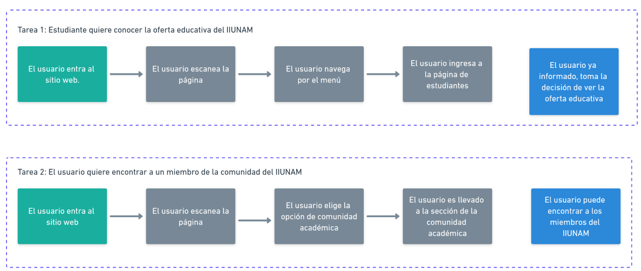
The website is predominantly used by the internal community of IIUNAM, as well as students from various educational levels and different parts of the world.
The internal community that uses the site seeks to stay updated on new events, articles, news, and access exclusive community functions.
Regarding students, the majority are interested in gaining a deeper understanding of the areas of study that IIUNAM focuses on, as well as its projects, academic offerings, and contact information.
After several meetings with members of the Institute and users of the portal, the following insights were found regarding the use of the current homepage:
- The page is too long.
- There is too much white space between elements.
- The "above the fold" section is not fully utilized.
- The different sections are too large.
- The navigation menu does not provide enough options, and the content does not match the rest of the portal.It is difficult to find specific types of information.
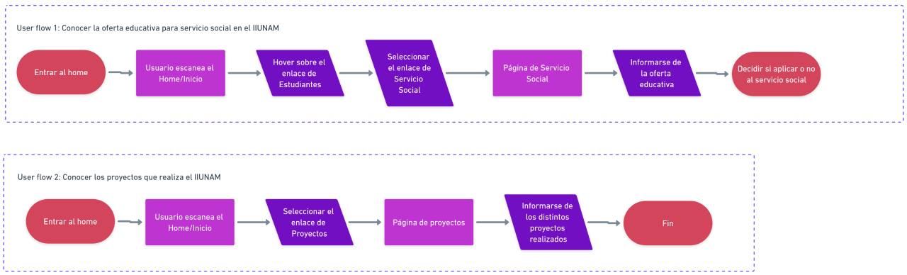
- There is no way to find a member of IIUNAM from the homepage.
Users feel frustrated when trying to find information beyond what the 4 navigation links allow. If they want to find something, they have to wait and see if selecting a link leads them to the correct option; otherwise, they have to start searching again using the SharePoint navigation.
Users wish to access exclusive content for the IIUNAM community. However, they have to scroll all the way down to the footer to access the most important functionality for the internal community, known as the INTRANET.

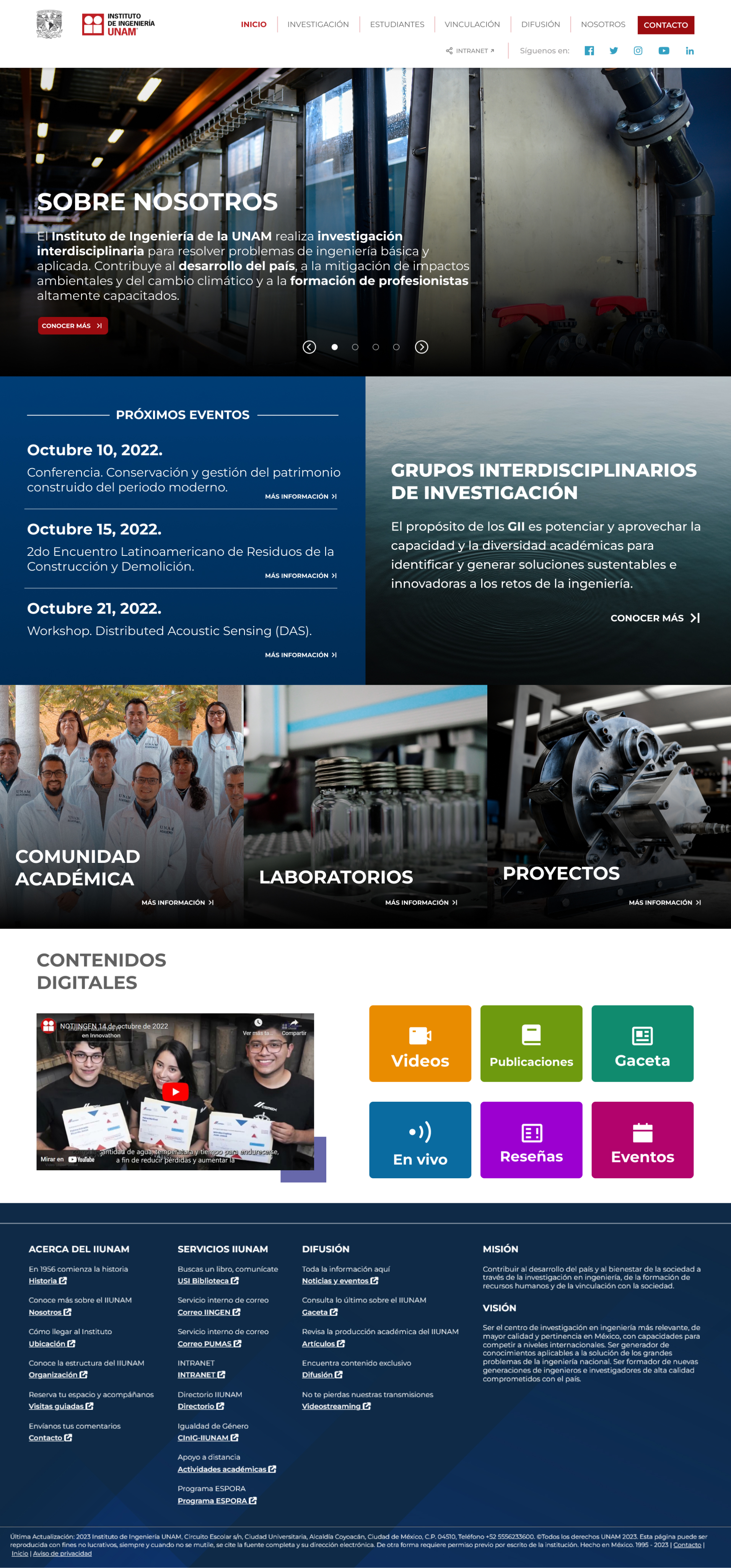
The proposed Minimum Viable Product (MVP) is a homepage that aims to improve the experience of both current and new users. This will be achieved by implementing a navigation menu that matches the rest of the website, ensuring a unified navigation experience. Additionally, the navigation will include a direct link to the INTRANET, allowing the community to immediately access the most important function for them.
Furthermore, the goal is to make the most of the available "above the fold" space by using sliders that will serve as welcome screens where users can learn more about IIUNAM, as well as events and news.
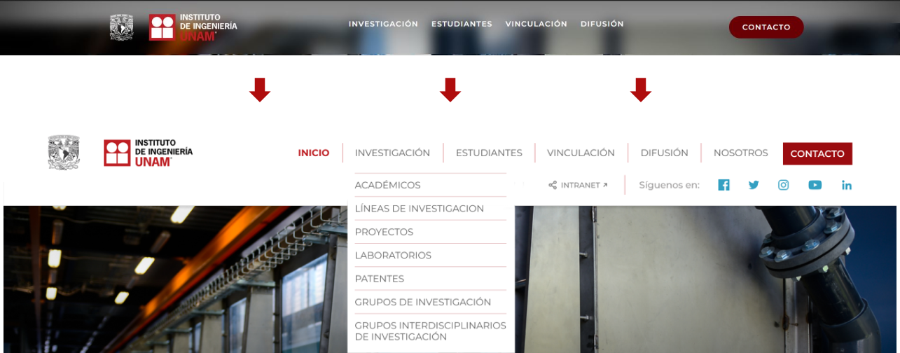
1.- Improve the navigation menu:
The original menu consists of 4 links and a CTA (Call to Action), which cover the general navigation of the Institute. However, due to the extensive amount of information that an educational entity like IIUNAM publishes and stores, it is proposed to implement a broader menu that encompasses the options already functioning within the SharePoint portal.
Similarly, the use of a dropdown menu is proposed to facilitate information search for users. Below the navigation menu, the addition of a social media contact bar and a direct link to the INTRANET for IIUNAM members has been suggested.
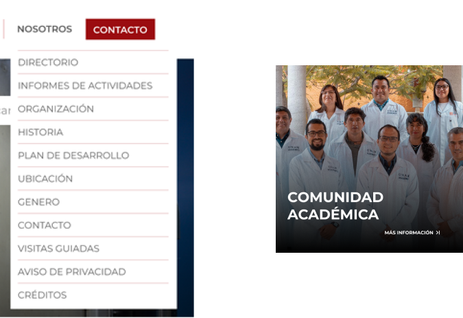
2.- Finding a member of IIUNAM from the homepage:
To address the need to find someone specific, building upon the new navigation menu options added in the previous point, the "About Us" link in the navigation bar will include a directory option. Furthermore, the "Academic Community" section of IIUNAM will be implemented, providing an extensive directory of researchers, academic technicians, and Conacyt chairs.
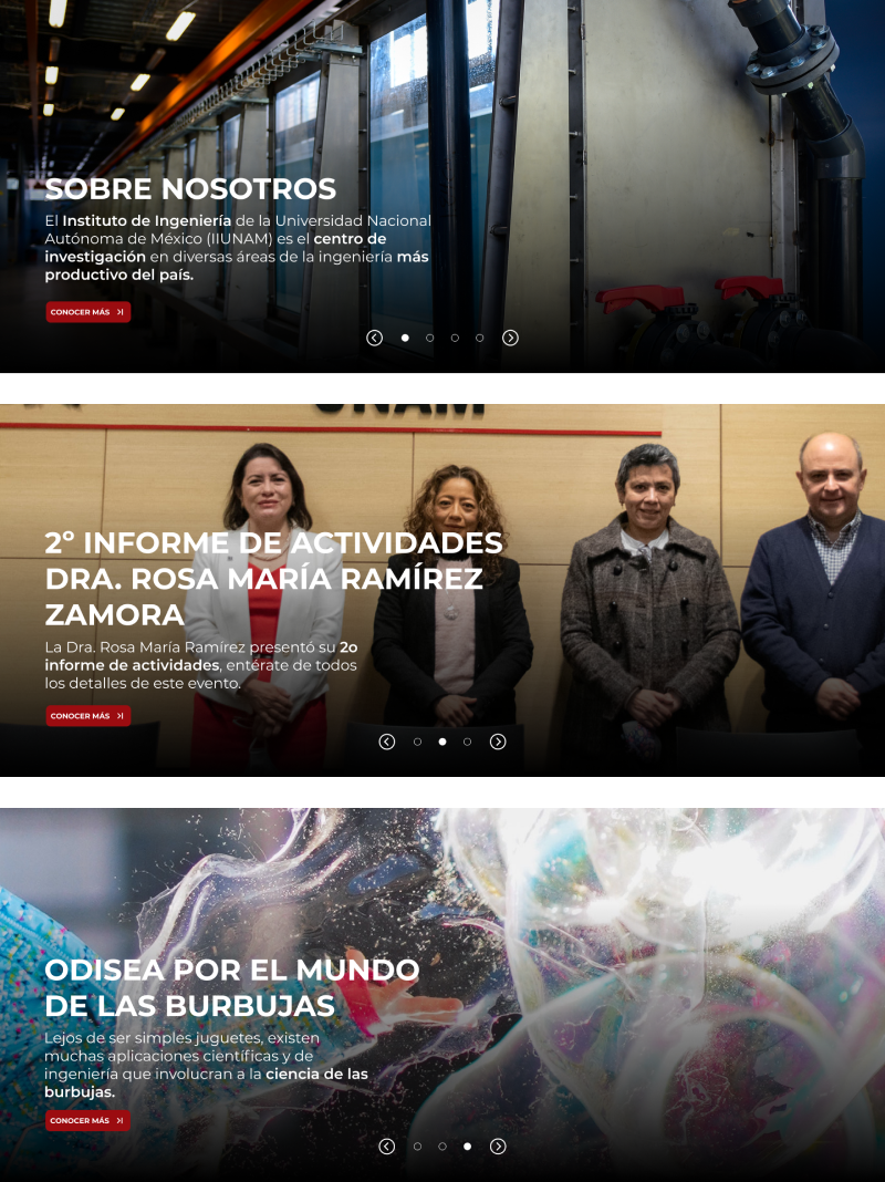
3.- Make use of the "above the fold" section and shorten the length of the page:
In this aspect, it is proposed to utilize the hero section of the page as a carousel to showcase different banners that lead to various pages of interest. Upon opening the portal, users will find pages covering events, ceremonies, articles, publications, announcements, and more. This approach will help optimize the space and provide easy access to diverse content without the need for excessive scrolling.
4.- Optimize the space of the page:
To make better use of the page space, it is proposed to implement a modular structure that allows for displaying a large number of sections without compromising hierarchy or visual order.
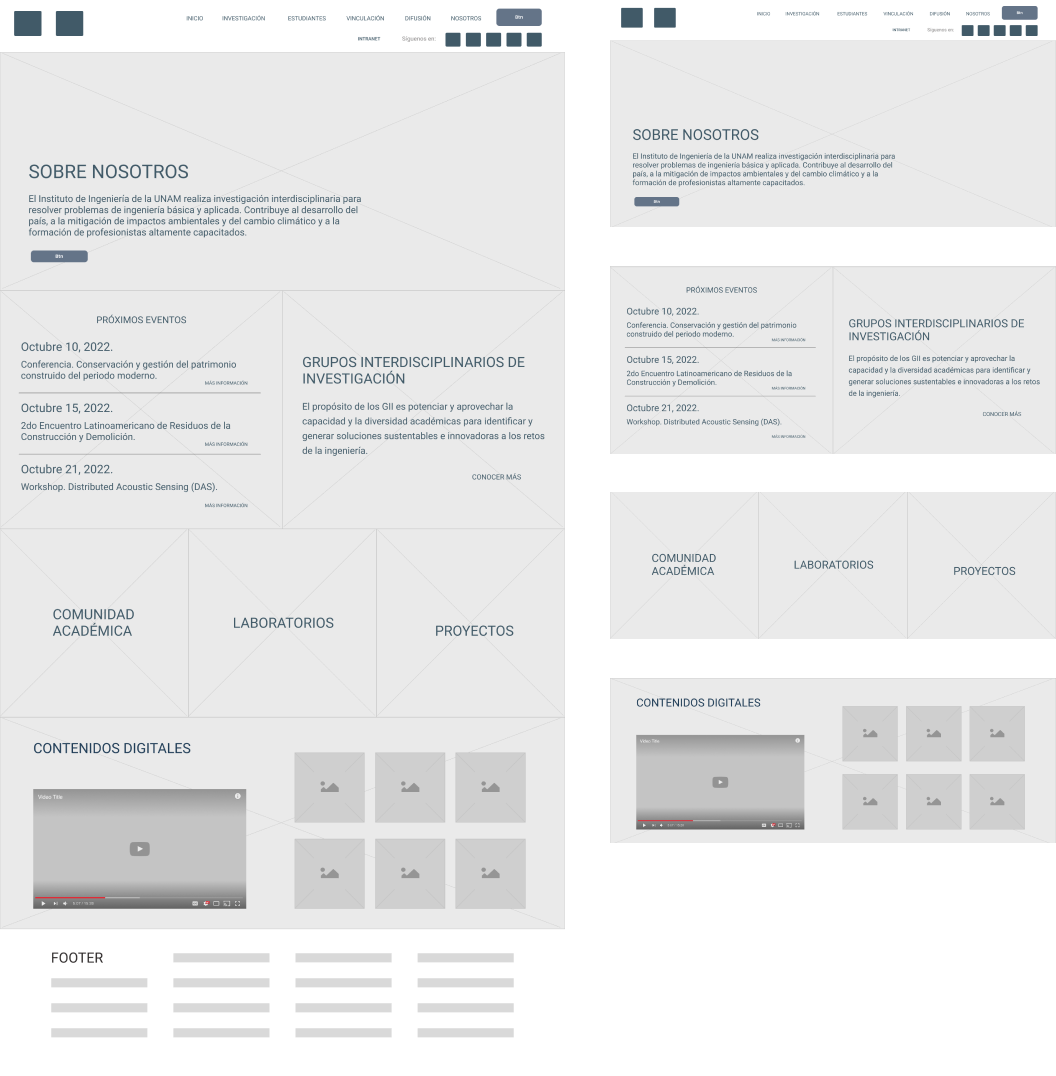
In the original page, the navigation was organized through horizontal blocks that occupied a specific area for each type of information. In this proposal, a block-based layout was used, based on a series of symmetrical grids.
Information that didn't require much space was condensed into smaller areas, aiming to optimize the available space.
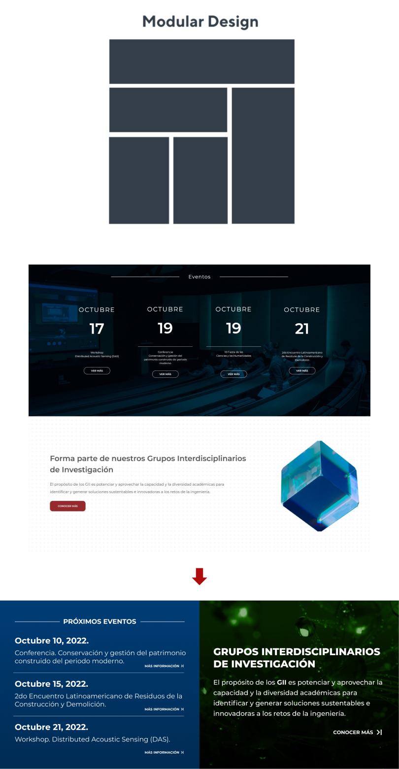
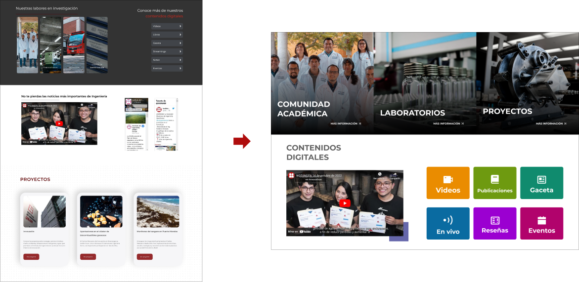
For the Research Activities and Digital Content sections, it was proposed to discard the research groups part, as it can already be accessed from the menu and the GII section. This shift emphasizes the academic community, laboratories, and projects.
The Digital Content section was separated into a narrow block to provide organization for the various options that users can find within the page. Alongside it, the weekly news section "Notiingen" was integrated.
The Projects section was removed; however, they can be more prominently advertised from the hero section, which saves space for scrolling.


 Visit website